Making an accessible website
The idea for this accessibility website came as we were looking for alternatives to an in-person conference that had been planned before Covid-19 changed all our plans. Rachael and I were placed on furlough and all of a sudden, we had no conference to arrange and lots of time on our hands.
We decided to try and pull together some of the conference ideas into a website and use it as a central point to collect the experiences of science centres. We had very limited website design experience, so after gaining support from ASDC we set out on a fairly intensive learning journey.
At Winchester Science Centre we have seen the power of consultation and using authentic user voice, so we enlisted Dr Katherine Deane to help embed user voice and spoke to some of our contacts about some good examples of accessible websites, (we were recommended https://www.specsavers.co.uk/ https://www.manchester.ac.uk/ https://www.savethechildren.net/ https://www.co-operativebank.co.uk/ as good examples). We launched into the design process with buckets of enthusiasm end energy. We had decided to use WIX as it is easy to use and still get a professional look.
Rachael and I were very pleased with our first iteration, it looked clean and easy to read, as well as being contemporary in design and looking colourful and interesting………or so we thought. To test our site we used a free screen reader, with which we struggled to navigate the site. We followed this up by getting some initial feedback from our contacts. Following these experiences we deleted the site and re-evaluated our process.
We read some useful books and websites before we restarted the design process (including Accessibility For Everyone by Laura Kalbag) and then launched into the new design process where we started with our accessibility aims at the front end of the process.
Wix has a useful suite of accessibility tools and also a help section that explains how to order the headings for websites to maximise ease of navigation. We used this along with the key list of requirements that we had gathered together from our reading.
The website design had to:
- Be readable on browsers and on mobile devices.
- Be able to be easily read and navigated at 200% zoom (a key threshold for many VI readers).
- Be easily read with minimal distractions using clear dyslexia friendly text, formatting and colours.
- Good contrast (free online tool - https://www.checkmycolours.com/).
- Be easy to navigate using a mouse or just a keyboard.
- Have a strong and easily navigable structure.
- All pictures had to have alt-text.
When we had completed our second draft putting accessibility at the front of the process we were surprised at how much better the new site looked compared to our initial attempt, it felt more modern and was a much easier experience to read and navigate. It really did lend weight to the concept that if you design for accessibility you improve the experience of everyone.
Following this initial assessment we asked for feedback (which was largely positive, only a few tweaks to make) and then we ran it through two free web accessibility evaluation tools:
WAVE Web Accessibility Evaluation Tool (https://wave.webaim.org/ easy to use with detailed analysis)
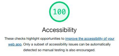
Lighthouse Accessibility Evaluation Tool (https://developers.google.com/web/tools/lighthouse a detailed tool that we had to get assistance from someone with more development skills to use)
We were delighted that we got a good report from WAVE, and that Lighthouse gave us accessibility scores of 100% for browser and 99% for mobile platforms
We really enjoyed the challenge of creating this website and we learnt a lot that we can put to good use when we do festival sites and review our own resources.
We found the following free sites useful on our journey:
https://abilitynet.org.uk/node/147 (as a good central hub of information on accessible website design).
https://www.w3.org/WAI/ (web accessibility information).
http://www.vischeck.com/ (simulates what your image looks like with colour blind vision).