Sensory guides at Eureka! The National Children's Museum

Eureka! is an extraordinary fun-packed day out for kids aged 0-11. With hundreds of interactive exhibits designed to inspire enquiring minds to find out about themselves and the world around them. We know that visitors with sensory conditions can find certain elements of any environment – let alone an interactive children’s museum – overwhelming at times. This is one of the many reasons that we work hard to make visiting Eureka! accessible for as many families as possible.
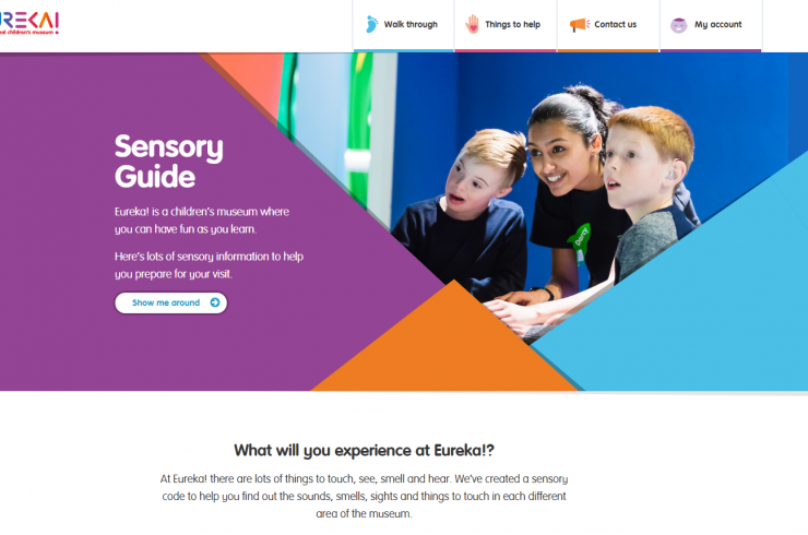
As part of our support for visitors with autism, we train our staff in autism awareness, have ear defenders and a Chill Out Room available, and we also had a sensory guide which we would send out to visitors who requested it, or they’ve been able to download a copy from our website. We launched version 1 of The Eureka! Story booklet back in 2013, having worked on the content with some of our visitors with autism to ensure that we were giving them all the information that they wanted and needed to prepare for their visit. Since then, we’ve given out hundreds of copies, as well as being approached by other museums and visitor attractions hoping to develop their own sensory guide. The problem with leaflets? Things have a habit of changing, and while you can update online PDFs it’s a bit tricky to retrospectively add in a Changing Places loo, new galleries, exhibitions, etc. Also, let’s face it, PDFs aren’t the most accessible format, so in 2019 we decided to take our sensory guide online: https://sensoryguide.eureka.org.uk/ We worked with our digital agency Rubber Cheese to launch the Eureka! Sensory Guide – a microsite packed full of information, images, videos and even sounds to help visitors with sensory conditions to plan and prepare for their visit. Their designer dived head-first into researching accessible design and produced a clean, concise design, using an autism-friendly colour palette, incorporating logical, step-by-step navigation with clear calls to action and contact routes.
Co-creation with children and families is embedded as part of our practice for creating new galleries and exhibits, so it made sense to apply the same approach to the development of our Sensory Guide. When we first created the paper version in 2013 this was done in close collaboration with families with sensory conditions. Similarly, when we developed the online version it was important to test and get feedback from families throughout the process and respond to their needs.
We funded the costs ourselves as part of our commitment to ensuring Eureka! is accessible. As with any web development project ensuring all the requirements are detailed at the beginning of the process to avoid delays and additional costs. We track the website traffic to the Sensory Guide microsite, which has been steadily climbing since we launched on World Autism Awareness Day - 2 April 2019. We have been particularly pleased that the average time spent on the site is now almost three minutes which demonstrates a high level of interaction and engagement with the content. Previous to the COVID-19 lockdown we had been experiencing a record number of visits from children with disabilities, including those with sensory conditions. We're looking forward to welcoming them back once we reopen again.
Was it worth doing? Absolutely! Investing in digital and using innovative techniques to make sure that Eureka! is accessible has been a rewarding project to lead on.
